
No matter how powerful its message, an internal “call to action” can easily get lost in the daily shuffle at the office. If your audience cannot recall the strategy behind an initiative, or remember it accurately, it won’t have the lasting power necessary to drive a change in workplace behavior. With inboxes overflowing and employee engagement a constant challenge, it’s crucial that key internal communications initiatives stand out. A well-crafted visual identity can help to do just that.
A visual identity uses symbols, color, typography and other elements of a brand to connect to a message in a consistent way. It establishes a visual grammar that endures over time, punctuating each message with deeper meaning while operating within the framework of the corporate story. While visual identities are most commonly associated with external messaging, internal communications teams are increasingly implementing them for employee-focused campaigns in the workplace and beyond. Below are four rules for creating an engaging and effective visual identity for your next internal initiative.
- Simplicity is power.
Perhaps the most important rule for a visual identity is to keep it simple. Symbols are a perfect creative solution to simplify any message. They also “read” well in various formats and across different scales, whether embedded in a mobile app or writ large on a poster seen across a warehouse or a staff break room.
Symbols are powerful because they evoke a host of pre-existing associations, infusing the visual mark with built-in resonance. Consider the “Guardian on the Go” identity we co-created with Guardian Life Insurance.
This program helps Guardian employees transition to, and work productively in, a mobile work arrangement. The visual system and logotype are anchored by a GPS-style pin on a map—signaling both mobility and location-finding. Meanwhile, the silhouettes of the people inside the pin underscore Guardian’s message: that the Guardian mission happens wherever its employees go, transcending the traditional office.
“Guardian on the Go” worked within the organization’s brand guidelines to color-code the three steps employees and managers needed to take to participate in the pilot. The color system and pin were used across a variety of materials including toolkits, overview presentations, and leadership training materials.
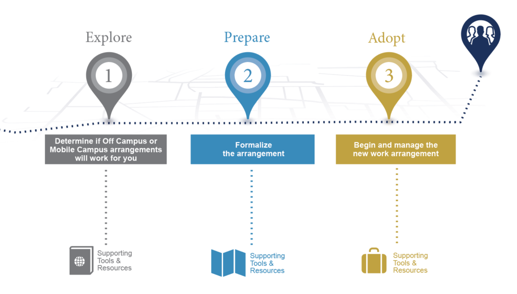
The pilot program launched with overwhelming success, fueling plans for a company-wide rollout in 2017. Ninety-two percent of employees who participated in the pilot were satisfied with "Guardian on the Go," and 100 percent of surveyed managers felt supported throughout the launch and implementation. All of this success tied back to a big change initiative fueled by a small, memorable symbol at the heart of their communications efforts.
- Make your identity memorable, yet emotional.
Symbols make your campaign memorable because they’re easy to remember—that much is obvious. What’s less obvious, but equally significant, is that visual identities should personally resonate with the audience, making your message memorable and emotionally relevant.
Let’s take a look at Exelon’s “IT’s for you" campaign. "IT” is the recognizable visual component, but incorporating it into the phrase “it’s for you” makes for the perfect play-on-words scenario.
The intent of this initiative was to reframe internal perceptions of the Exelon IT department. This campaign is playful and smart enough to signal a real difference in how Exelon IT goes about supporting their workforce.
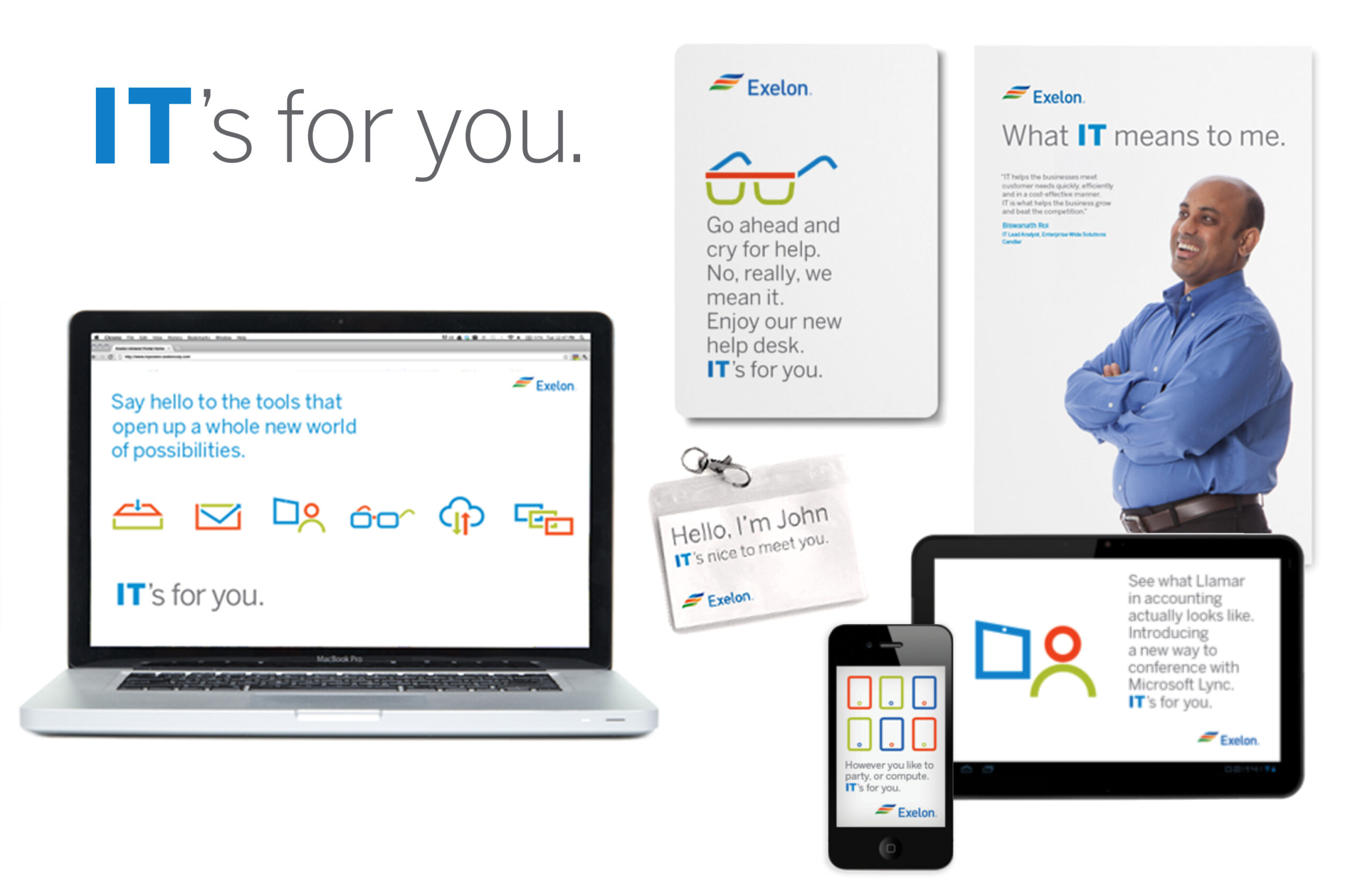
The visual concept also allowed for a personal sense of humor to be infused into the content of various channels, making “IT’s for you” even more emotionally connected to the viewer no matter how they were interacting with it.
Our previous post on 5 Unexpected Benefits of Emotional Storytelling shares key findings from neuroscience on why emotionally infused communications are more memorable and effective.
- Stay on brand, with a new and fresh twist.
A visual identity for internal communications must operate within company brand guidelines, but it should also stand on its own. A crucial change or engagement initiative can’t blend into all the other communications employees or leaders receive.
Earlier this year, Gagen helped a global healthcare company develop the “Together We Can” theme to re-invigorate and engage business segment leaders in a renewed global strategy at an annual leadership conference. The five dots in the symbol’s center visually represent the five pillars of their strategy.
The mark includes an abstract element, but still emotionally resonant in its associations: it suggests both a kaleidoscope, with its multi-faceted perspective, and a huddle of diverse teammates preparing to take a winning strategy out into action. The symbol was visible at different scales and was flexibly color-coded. Each speaker’s presentation reflected the color of the pillar they explored—green for productivity, for example.
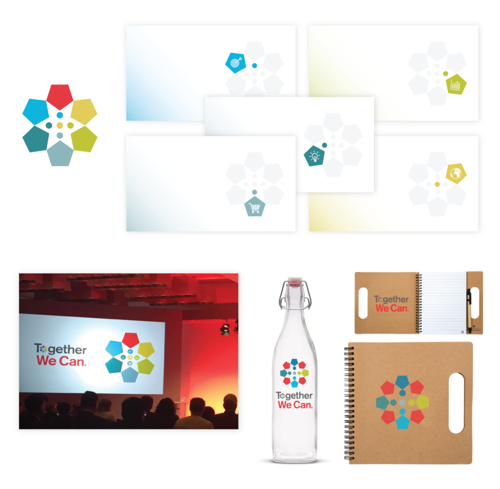
The mark and tagline appeared cohesively throughout most of the event’s materials and speaker presentations, but the emblem for the “o” in “together” could also stand on its own as a symbol of collaboration and diversity representative of the company culture.
- Drive towards action.
A successful visual identity highlights the campaign call-to-action, which, for internal audiences, often means introducing a change in process, a new resource, or a new tool into the workplace. Employees must understand the how—and the why—behind employers providing them. The campaign must also recharge, inspire, and motivate employees toward the desired behavioral change. A strong visual identity distills the campaign messaging into a simple, unforgettable visual and directs employee action clearly, persuasively, and authentically. It infuses the workplace with the energy necessary to achieve the desired outcomes internal communicators seek.
Need help developing an impactful visual identity for your internal campaign? Contact Gagen MacDonald Creative Services today.
